Within the small corpus of Netherlandish art treatises, Samuel van Hoogstraten’s Inleyding tot de hooge schoole der schilderkonst, anders de Zichtbaere Werelt stands out as one of two substantial accounts of painting penned by a seventeenth-century artist (fig. 1). His text has provided valuable eye-witness commentary on Rembrandt’s art and teaching and offered numerous insights into Dutch art and culture more generally. Today digital editions and published translations have made his text accessible to a broader international readership than ever before.1 At the same time these technologies have enabled changes in format, medium, and search capabilities that have literally transformed Van Hoogstraten’s text and the ways we read it. Early modern print technologies and typographic conventions played an equally critical role in shaping the reading habits of Van Hoogstraten’s early readers. Yet the focus of modern scholarship on the content of art theoretical writings too often overlooks, or takes as self-evident, the practices of reading, writing, and thinking that produced these books and the kinds of reading they invited. Taking account of these marginalized practices can offer fresh insights into theoretical texts and what contemporary and near-contemporary readers made of them.2
This article reveals what we can learn about Van Hoogstraten’s treatise and its reception by examining three types of material evidence derived from extant copies of his Inleyding, or Introduction to the Academy of Painting.3 It begins with questions of format and function, focusing on the integral role of graphic design in the conception of the book. It then turns to the marginalia in a richly annotated copy of the book for clues to ways early readers read and used it.4 Finally, it considers some custom-bound editions of Van Hoogstraten’s book that shed further light on its academic readership and functions during the century and a half following its publication.
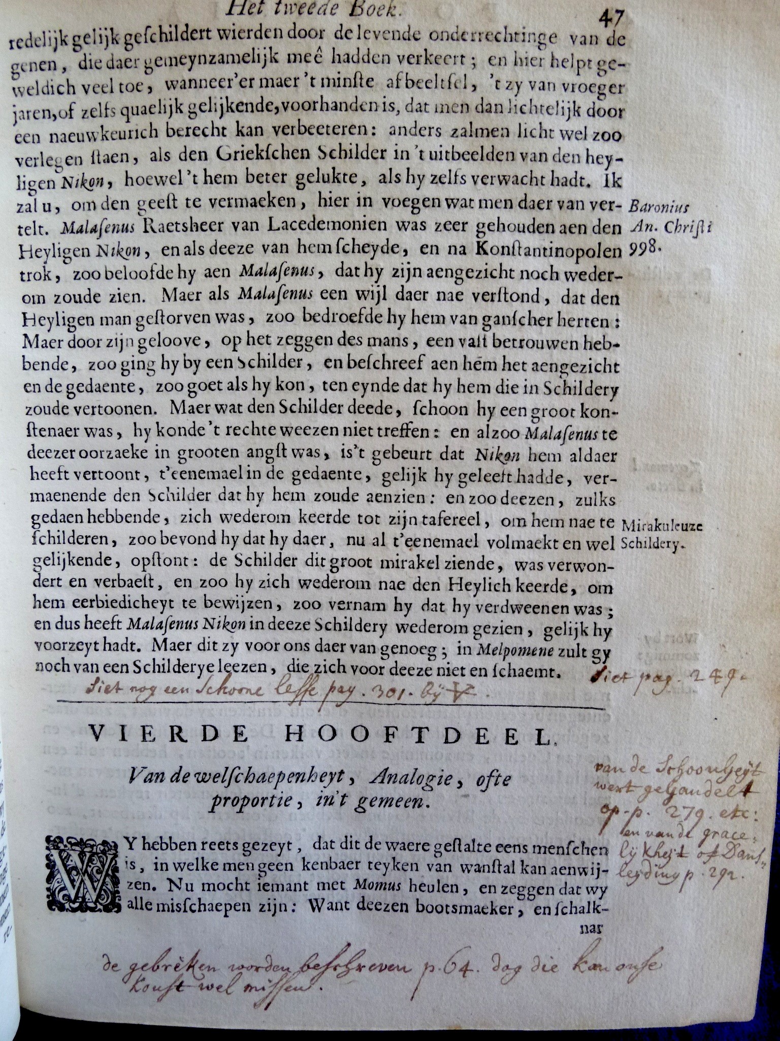
Van Hoogstraten intended his book to serve as a comprehensive reference work on painting that combined a methodical program of instruction with a comprehensive description of the art and its purview.5 Faced with the task of organizing a large body of textual material and practical knowledge between two covers, he envisioned his text spatially as a nine-part Academy governed by the Muses. Working with his brother Francois, who was its publisher, Van Hoogstraten supplied the nine leerwinkels, literally ‘workshops’ or ‘stores’ of teachings. Housed in his academy-in-print with inventive emblematic title pages, each comprising an original etching accompanied by explanatory poems that summarize the governing conceit of each print and the contents of each Muse’s store of knowledge. This encyclopedic framework, which aided in compiling the text, later served as a mnemonic device for its readers. He designed in-text anatomical figures and diagrams in his chapters on proportionality, as well as illustrations explaining the principles of perspective and optics discussed in his book on light and shadow. In both cases the illustrations demonstrate his own scientific knowledge and the rational basis of his teachings. Bold chapter headings with italicized titles signpost the progression of topics addressed in the sequential instructional program that forms the book’s through-line. He supplemented these divisions with way-finding marginalia of two kinds. One sort provided references to source material or authors mentioned in the text, as was customary in scholarly compilations. Other marginal notes gloss the topics and exempla discussed in each chapter (fig. 2). Proper names, rendered in italics in the body of the text, join these marginal tags to facilitate skimming and piecemeal consultation. A register at the end of the book further aids browsing by providing a list of headings to help readers locate passages of interest. The absence of an alphabetical index with page references required readers to read around in the text to gather material on related topics and collate it to suit their own purposes. These typographical features, which serve the book’s dual agenda of compilation and instruction, thus engaged various habits of reading, notetaking, collecting, and comparison of sources that were current at the time.6
Readers and Uses
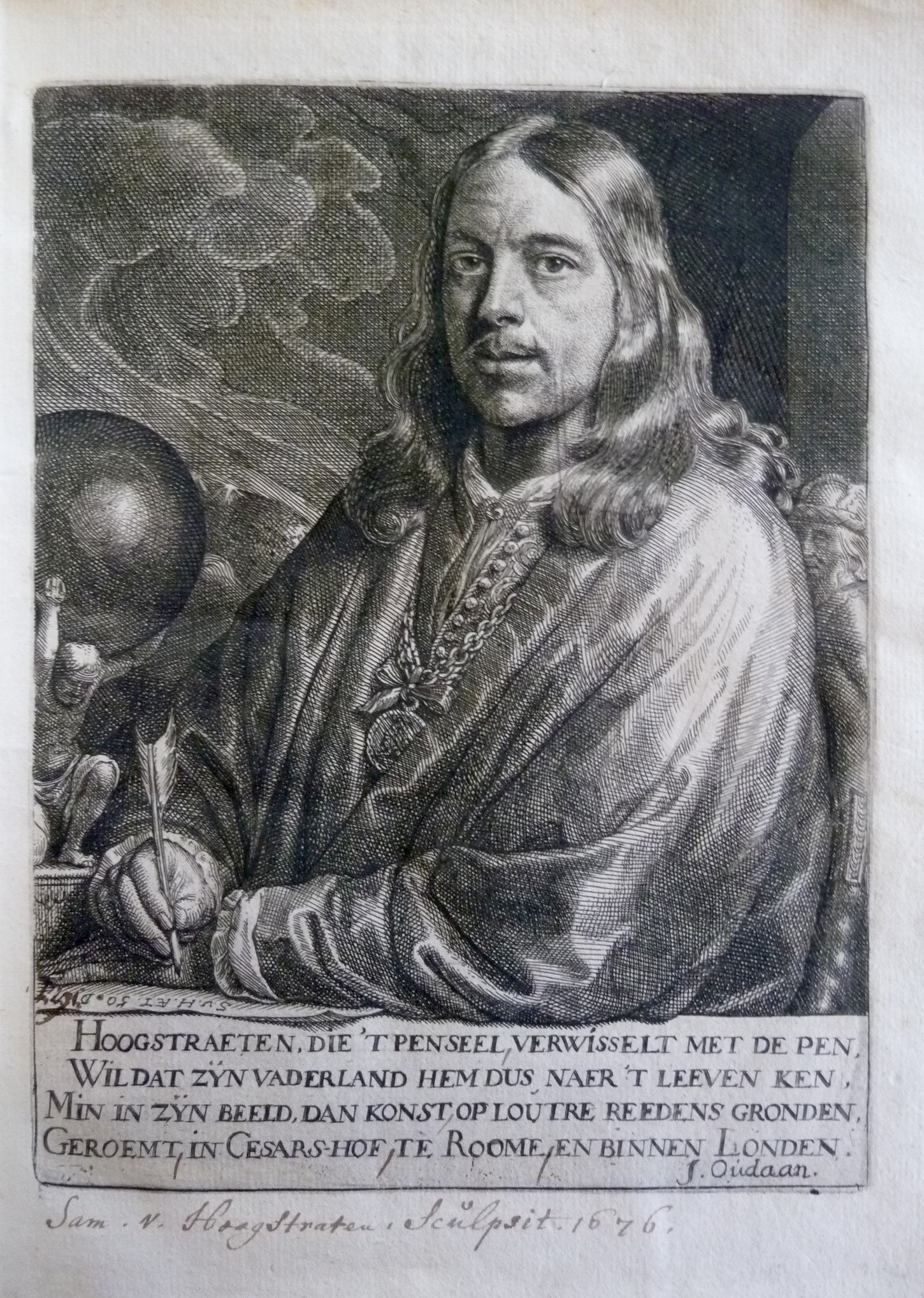
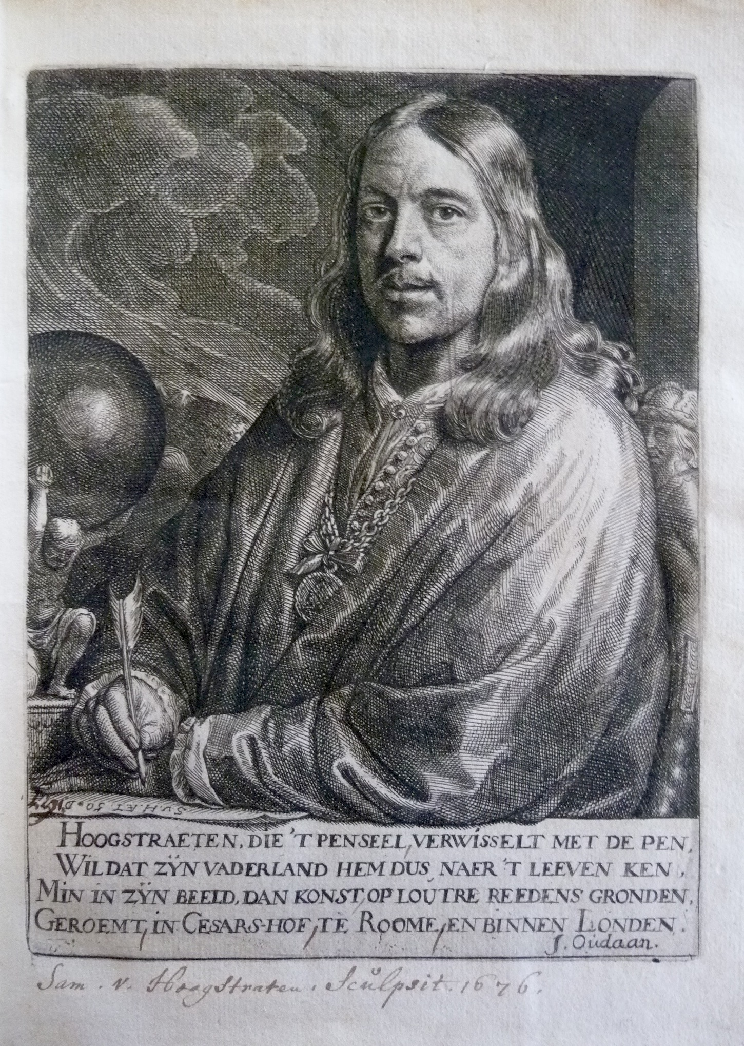
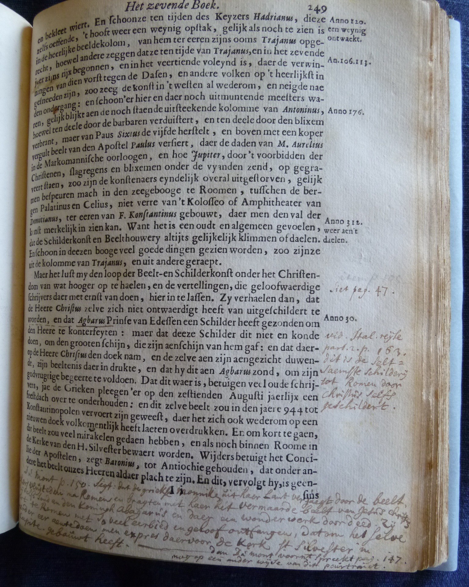
The Academy’s typographical design speaks to the multiple audiences to which the book was addressed, notably: aspiring painters of ambition, fellow artists entrusted with the training of painters, and a broader Dutch reading public of amateurs, antiquarians, and others seeking knowledge of the arts. Each group would have read the book through its preferred lenses. For example, when the book was hot off the press, Van Hoogstraten promptly sent a copy to his friend Joachim Oudaen, who had contributed to the book a substantial liminary poem as well as laudatory verses accompanying the author’s portrait (fig. 3).7 Oudaen, who had recently published a numismatic history of the Roman Empire and its customs8, read the book with keen antiquarian interest. He responded with queries in a letter that does not survive, but his questions were addressed point-by-point in a reply from Van Hoogstraten dated 22 May 1678.9 Citing his sources in the margins, and assessing documentary evidence, he eagerly sparred with Oudaen as a scholar and fellow antiquarian on matters of chronology, technology, and customs relating to pictorial images and their uses. Oudaen’s questions focused predictably on historical matters taken up in Van Hoogstraten’s novel chronicle of the origins, progress, and the changing fortunes of the art precipitated by world affairs.10 Notably the marginalia in that chapter mark key dates that serve as a timeline and identify it typographically as a chronicle, a genre convention that would be immediately recognizable to scholarly readers (fig. 4).11
 |  |
Academic Artist/Readers
A copiously annotated volume in the Rijksmuseum Library offers a unique register of the diverse interests of several early readers who left their marks in the margins (figs. 2-6).12 At least three hands, one probably from the late seventeenth and the others from the eighteenth century, inscribed more than half of this volume’s pages with marginal notes. Several of the earlier annotations cite comparative material from other sources and compilations including some that had appeared since the Inleyding’s publication.13 These notes reveal readers engaging with the book as a reference work to be supplemented, much like a commonplace book for collecting and comparing sources on topics of interest. Among the most interesting of these annotations are detailed comparative references to the newly published travels of the French journalist and historian Jean Dumont that reflect the reader’s interest in religious history and the documentation of miraculous images.14
Far more of the book’s marginalia suggest its use by artists or art instructors with a pedagogical interest in the text. Their notes consist largely of internal cross-references that throw the book’s instructional program into higher relief. Several annotations link discussions of topics that are treated in multiple contexts—such as landscape, hairstyles, clothing, and animals.15 For one reader, Van Hoogstraten’s literary excursions, digressions, and accumulation of tangential materials—the ‘Visible World’ that is painting’s domain—clearly intruded on the step-by-step curriculum set forth in the Academy’s nine stores of teachings. His cross-references seek to refocus attention on lessons, often with a more classicist agenda. A noteworthy example occurs at the end of a chapter in Polymnia’s book 2 on portraying likeness (fig. 2).16 Where Van Hoogstraten mentions that a further exemplary picture will be discussed in Melpomene (book 7), the annotator located that discussion on page 249 and flagged it in the margin for easy retrieval. He added that a further ‘beautiful lesson’ [Schoone lesse] on this subject appears on page 301 and flagged both passages with matching V-shaped markers. In a critical aside in the lower margin, as if speaking to students, he advises discounting the counterexamples that conclude Van Hoogstraten’s discussion of proportionality, noting that ‘deformities are described on p. 64, but our art can certainly do without them.’17
Whether or not he appreciated Van Hoogstraten’s ekphrastic wit in evoking literary depictions of ugliness, his admonition emphasizes that painters are not meant to emulate them. His added references to later lessons concerning beauty, grace, and dance-like movement draw attention to matters of selective imitation. Van Hoogstraten had deferred these aesthetic imperatives by design to stress the importance of learning first to observe and imitate nature in all its diversity. This reader’s academic approach is also evident in his cross-referencing of nearly all mentions of Rembrandt to page 273, where Van Hoogstraten coupled high praise of his teacher’s excellence in the art of reflections with a wish that Rembrandt had better understood the rules of that art.18 This reader further underscored the importance of scientifically based practice through comparative citations of academic texts, including Girard Desargues on perspective, and Willem Goeree on anatomy, sources that supply the underlying rationale for various methods of creating the illusions of projection, recession, proximity and distance through textural relief and chromatic modulation.19
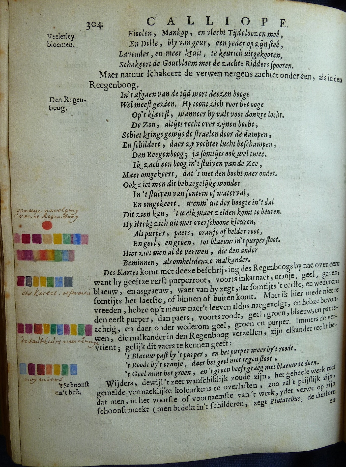
The most striking marginalia in this volume are several watercolour annotations that gloss Van Hoogstraten’s discussion of the rainbow. The annotator has highlighted a passage that pivots between viewing the rainbow as an example of nature’s artistry that epitomizes the soft conjoining and colour harmonies which painters should imitate, and as a natural phenomenon of interest to experimental philosophers (fig. 5).20 It begins with a verse paraphrase of Van Mander’s evocation of the rainbow’s colours in the Grondt or ‘Foundation of the Art of Painting’21 followed by a comparative summary of René Descartes’ description of the sequence of colors in the rainbow which, Van Hoogstraten notes, basically aligns with Van Mander’s.22 Testing both accounts against an experiment of his own, he presents an amended chromatic sequence based on his close observation and depiction of the rainbow’s colours from life, thereby demonstrating the value of the painter’s skills in pursuing new knowledge of nature. He concludes with a short mnemonic verse reprising Van Mander to remind his readers of the colour harmonies that the rainbow exhibits, noting that, ‘After all, the colours that accompany each other in the rainbow are truly friends with each other, as this verse indicates:
The blue goes with the purple, and the purple again with the red,
The red goes with the orange, which does not offend the yellow,
The yellow loves the green, and the green likes to be close to the blue.23
What is interesting about the reader’s marginal notes is his attention to distinguishing each chromatic sequence both visually in his depictions and conceptually through precise captions. He differentiates the received studio knowledge from Van Mander, labeled as the ‘customary imitation of the rainbow’ [gemeene navolging van de Regenboog], from Descartes’ reported experimental finding [Des Kartes’ observatie] and from the author’s direct observation [des aútheúr’s waerněminge]. Beneath these comparisons the annotator also depicted the sequence of related colours named in Van Hoogstraten’s rhymed mnemonic, above the caption ‘furthermore’ [nog anders] marking it as the aesthetic corollary to the experiments described above. These considered annotations suggest both the reader’s interest in and understanding of the issues at stake in Van Hoogstraten’s argument.
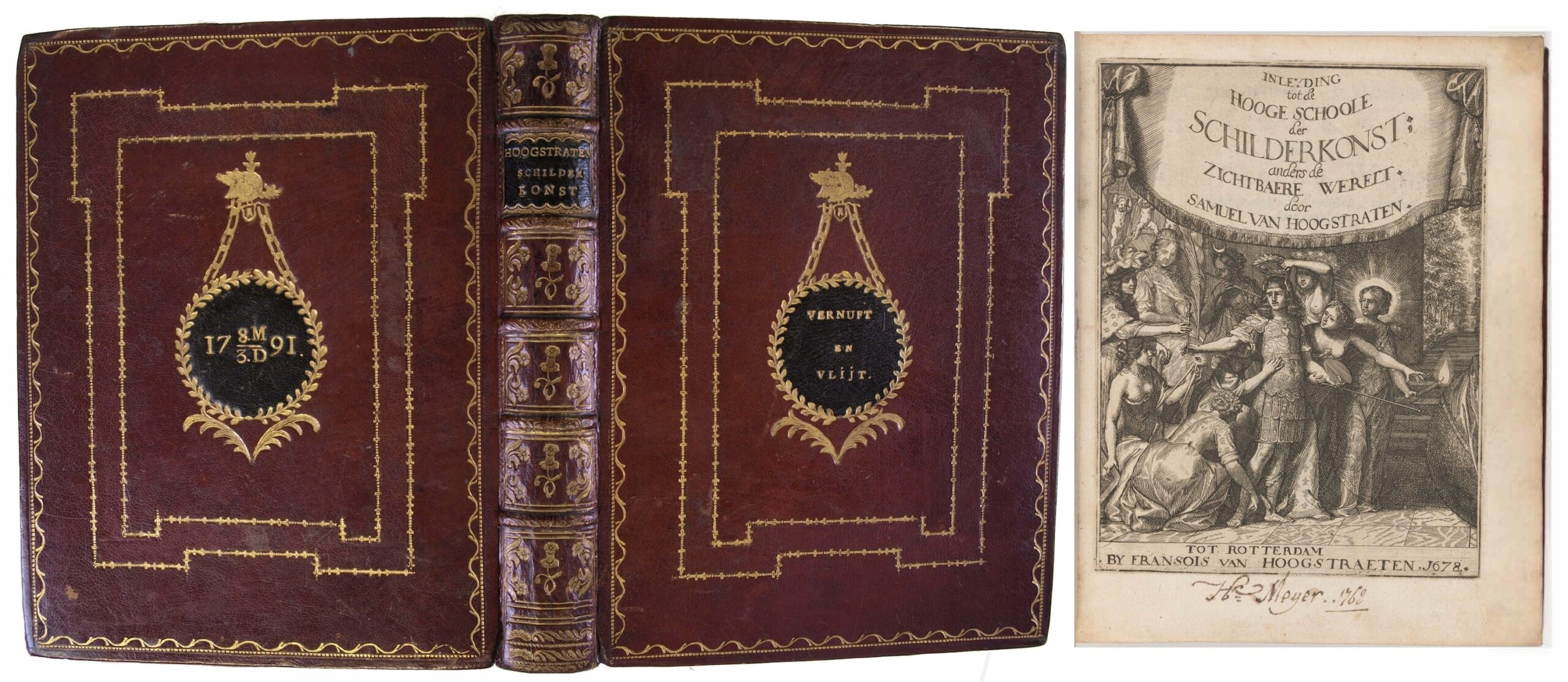
Taken together the marginalia in this volume reflect the input of multiple users, and possibly successive owners. That so many annotations concern pedagogical matters further suggests that several of these writers, and perhaps the book itself, may have belonged to an art academy. One such institution, the Middelburg Teeken Akademie, actually commissioned specially bound copies of Van Hoogstraten’s Academy of Painting, to be awarded as prizes for excellence in drawing and painting from the late eighteenth and into the nineteenth century.24 Extant volumes in prize bindings feature the Academy’s motto ‘Vernuft en vlijt’ (Intellect and Diligence) embossed on the exterior cover and a wax seal bearing the imprint of its prize medallion encased inside the front cover (fig. 1).25 Although the prize volumes tend not to be annotated, the example now in the Folger Library was inscribed by a certain Mr. Meyer, who interestingly wrote his name on its title page in 1768, a good ten years before the founding of the Academy. Whether it was donated by Meyer or otherwise acquired by the Academy, this volume was in some sense an academic heirloom by the time it was bound for presentation in 1791.
A final set of documentary annotations on the prints in the Rijksmuseum volume is worth noting. The author’s portrait and each of the titlepage prints is inscribed in an eighteenth-century hand with Van Hoogstraten’s name and the date 1676 (fig. 3).26 These captions beg the question of who would have known or could claim to know when these prints were made. And who would have cared to document them is this way? Was it a family member, perhaps Van Hoogstraten’s brother Francois or his nephew the renowned scholar David van Hoogstraten, who captioned them? Or could the annotator have been Arnold Houbraken, who witnessed the production of these prints as Van Hoogstraten’s pupil in the mid-1670s?
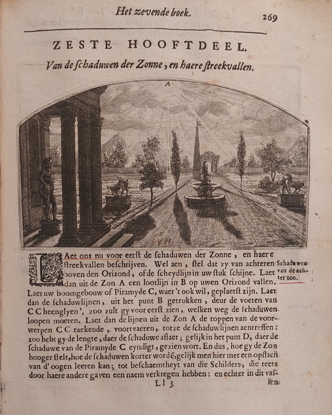
Houbraken mentions in his biography of his teacher that he would have had the honour of working with him on the book’s plates had not another student’s objections derailed the plan. By then, however, Houbraken had already made a trial print of the plate on p. 269, which illustrates the method for depicting shadows cast in sunlight (fig. 6).27 Some impressions of the print bear faint traces of Houbraken’s monogram at the lower right; however, in the Rijksmuseum volume, that print has been inscribed ‘SVH’ in dark brown ink at the lower center. Could the writer have wished to credit Van Hoogstraten with the invention of the design of Houbraken’s trial print?28 A similar ‘edit’ in dark brown ink, possibly by the same hand, appears on the author’s self-portrait (fig. 3). It emphasizes the date of [16]77 beside the artist’s monogram in the print, and thus disputes the date of 1676 given by another hand in the caption below. Without other corroborating evidence we may never be able to identify the writers responsible for these annotations.29 Nonetheless, the volume’s many anonymous inscriptions leave tantalizing traces of the book’s early users and their interests. Like the Middelburg prize volumes, they hint at ways Van Hoogstraten’s Academy in print remained a cherished relic of and memorial to the artist, and a catalyst for conversation among readers who pursued in their own ways the academic agenda that he worked so assiduously to promote.
- A printed facsimile of the treatise published by Davaco (Doornspijk 1969) is held by many libraries. Readers can now also find digital facsimiles of the original text on various websites including the Internet Archive, Google Books, and the Hathi Trust. The book is also available in two modern translations with commentary: Introduction a la haute école de l’art de peinture, Jan Blanc, trans., Geneva, 2006; and Samuel van Hoogstraten’s Introduction to the Academy of Painting; or, The Visible World, C. Brusati, ed., J. Jacobs, trans., Los Angeles, 2021.
- I am grateful to Stephanie Dickey for inviting colleagues to address just these issues in a stimulating conference session on ‘Meanings of Marginalia in Early Modern Art and Theory’ that took place at the College Art Association annual conference in
Washington DC in February of 2016. It is a pleasure to present her with this essay based on the paper I presented in that
session. - S. Van Hoogstraten, Inleyding tot de hooge schoole der schilderkonst, anders de zichtbaere werelt, Rotterdam, 1678. Hereafter page references to the original will be followed by corresponding pages in the English translation: Brusati, Introduction (see note 1).
- Rijksmuseum Research Library, shelf number 329 E11.
- For a fuller account of this process, see my introduction in: Brusati, Introduction (see note 1), pp. 8-20. For a detailed discussion of the book’s format and publication, see also H-J Czech, Im Geleit der Musen. Studien zu Samuel van Hoogstratens Malereitraktat Inleyding tot de Hooge Schoole der Schilderkonst: Anders de Zichtbaere Werelt (Rotterdam1678), Munster 2002, pp. 83-118, esp. 95-113.
- On these issues, see the R. Yeo, ed. Note-taking in Early Modern Europe, special issue of Intellectual History Review 20, 3 (2010). Especially useful for understanding Van Hoogstraten’s compiling project is the excellent study of early modern methods of scholarly compilation, A.M. Blair, Too Much to Know. Managing Scholarly Information before the Information Age, New Haven and London 2010.
- Oudaen’s portrait poem reads: Hoogstraeten, die ’t penseel verwisselt met de pen,/Wil dat zyn Vaderland hem dus naer ’t leven ken,/Min in zyn beeld, dan konst op loutre reeden gronden,/Geroemt in Cesars-hof te Roome, en binnen Londen [Hoogstraten who exchanges brush and pen/Wishes his fatherland would recognize him thus, true to life/less in his image than in his art based purely on reason and lauded at Caesar’s Court, in Rome and in London]. In a sixty-six verse liminary poem that is the longest and most ambitious of the book’s dedicatory verses, Oudaen develops the conventional metaphor of painting as a labyrinthine undertaking for which Van Hoogstraten’s pen and teaching provide Adriadne’s thread. Prompted by his close reading of the book his verses also incorporate novel poetic reflections on painting’s dreamlike capacity to reconstitute the visual world while captivating its viewers.
- J. Oudaen, Roomsche Mogentheid, Amsterdam 1664.
- The letter is in the manuscript collection of the Koninklijke Bibliotheek in Den Haag, KB, Hs. 424 B3. For a full transcription see M. Roscam Abbing, De schilder & schriver Samuel van Hoogstraten 1627-1678. Eigentijdse bronnen & oeuvre van gesigneerde schilderijen, Leiden 1993, pp. 78-80.
- Van Hoogstraten, Inleyding, 244-257; Brusati, Academy (see note 1), pp. 280-289. This chronicle opens book seven overseen by Melpomene, the tragic muse who in Van Hoogstraten’s scheme governs the realm of light and shadow. Though this historical digression is not obviously related to the optical matters that are the focus of Melpomene’s book, Van Hoogstraten explains its inclusion by metaphorically comparing painting’s historical vicissitudes to alternating periods of its emergence into light and decline into darkness. In doing so, he uses the book’s academic structure as a mnemonic device for incorporating his descriptive compilation into his instructional program. For a fuller analysis, see my introduction in Brusati, Academy (see note 1), pp. 19-20.
- This thirteen-page chronology of documented references to painting is one of the most original sections in the book. Framed as a world history detailing the impact of world affairs on painting’s progress and periodic setbacks, it departs significantly from the precedents set by Giorgio Vasari and Karel Van Mander in their biographically structured local histories of art. On the popularity of chronicling among early modern men of letters, see Judith Pollmann, ‘Archiving the Present and Chronicling for the Future in Early Modern Europe’, Past & Present 230, Issue suppl11 (November 2016), pp. 231–252. Another interesting example of Van Hoogstraten’s use of marginalia to signal an embedded genre distinction is his account of his journey to Vienna which he evokes poetically in verse juxtaposed to a running quotidian itinerary in the margins. See Van Hoogstraten, Inleyding (see note 3), pp. 201-203; Brusati, Introduction (see note 1). pp. 239-242.
- These annotations have largely escaped the attention of scholars. Czech, Musen (see note 5), p. *151, notes that the volume is annotated without further comment.
- Works cited include: George Sandys, Sandys Travels containing an History of the Original and Present State of the Turkish Empire, London 1673, Alexis of Piedmont (pseudon. Girolamo Ruscellini), De secreeten van den eerweerdigen heere Alexis Piemontois, Amsterdam 1596 or 1636; Petrus Lauremberg’s historical miscellany, T Nieuw vermeerderde Acerra philologica. Dat is, Ses hondert nutte, uytgelesenen gedenckwaerdige historien, Rostock 1633, reprinted in multiple editions and locations in the seventeenth and eighteenth centuries; and Jean Dumont, Reyzen van den heer Dumont door de grootste gedeeltens van Europa en Asia, Utrecht 1695. In addition to citing comparanda the annotators correct typographic errors in the text as well.
- For references to Dumont on miraculous images, see pp. 103 and 249. For Dumont on art in antiquity, see the marginal notes on pp. 240, 247, 358.
- Chapters on these topics in Erato (book 4) appear under the rubric of accessories on pp. 134,144, 147, 163 and are referenced to chapters on the same topics with respect to coloring in Thalia (book 6) on pp. 229-31.
- Van Hoogstraten, Inleyding (see note 3), p. 47 and: Brusati, Academy (see note 1), p. 100.
- ‘De gebrēken worden beschreven op p. 64. dog die kan onse konst wel missen’. See ‘Van de gebreken en de leelijkheyt’, Van Hoogstraten, Inleyding (see note 3), pp. 64-67; ‘Of Deformities and Ugliness’, Brusati, Academy (see note 1), pp. 119- 123.
- ‘Wonderlijk heeft zich onzen Rembrant in reflexeeringen gequeeten, jae het scheen of deze verkiezing van’t wederom kaetsen van eenich licht zijn rechte element was, had hy hem maer wat beter op de grondregels deezer konst verstaen : want die alleenlijk op zijn oog en gewende ondervindinge steunt , begaet dikmaels feylen, die den spot van leerjongers, ik zwijge van meesters, verdienen : en zoo veel meer, daer deeze zekere kennissen, voor die’er zich een weynig aen laet gelegen zijn, zoo gemakkelijk zijn te bekomen.’[Our Rembrandt has acquitted himself wonderfully in the art of reflection; yes, it seemed as if this choice of the re-reflection of any light was his proper element, if only he had had a better understanding of the basic rules of this art; for those that only rely on their eye and putative experience often make errors that deserve the scorn of pupils, not to mention masters, and much the more so, as this certain knowledge is easy to acquire for those who exert themselves a bit]. Van Hoogstraten, Inleyding (see note 3), p. 273; Brusati, Academy (see note 1), p. 303.
- Examples include a note on p. 272, comparing Van Hoogstraten’s illustration of Kamerlicht [Interior lighting], to plate 24 of Girard Desargues, Algemeene manier van de Hr. Desargues tot de practijck der perspectiven… Amsterdam 1664; a note on p. 265 stating the reason diminution creates recession is given in W. Goeree, Natuurlyk en schilderkonstig ontwerp der menschkunde Amsterdam. 1682, p. 367. Further notes on pp. 306-307 and references on p. 255 link Van Hoogstraten’s account of Jan Van Eyck’s invention of oil paint to Van Mander and to Goeree, Menschkunde, p. 135, where Van Eyck’s ability to pictorially distinguish the different voices of singing angels is credited to this technical innovation. Also noteworthy is the reader’s close attention to Van Hoogstraten’s discussion of the essential role of textural perceptibility [kenlijkheyd] and imperceptibility [onkenlijkheyd], rather than color alone, in creating the illusion of projection and recession. He has underlined both terms and written ‘Proof’ [Bewijs] in the margin by Van Hoogstraten’s explanation on p. 307.
- The passage appears in Calliope, book eight, chapter six, ‘Van de Tuiling, Schakeering, of byeenschikking der verwen’, Inleyding, p. 304; ‘Of the interweaving, Variegation, or arrangement of colours’, Brusati, Academy (see note 1), pp. 330-331. See also p. 346, note 16.
- Van Mander describes the rainbow’s colour sequence as purple, violet, orange or bright red, yellow and green until the blue strikes the indigo. For the paraphrased passage see Karel van Mander, ‘Grondt der edel- vry schilderkonst’, 11: stanzas 6-10 in Het Schilder-boeck, Haarlem 1604, fols. 45v-46r.
- Des Kartes komt met deeze beschrijving des Regenboogs by nae over een: want hy geeftze eerst: purperroot, voorts inkarnaet, oranje, geel, green, blaeuw, en asgraeuw, waer van hy zegt, dat somtijts ‘t eerste, en wederom somtijts het laetste, of binnen of buiten komt. Maer ik hier mede niet te vreeden, hebze op’t nieuw naer ’t leeven aldus naegevolgt, en hebze bevonden eerst: purper, dan paers, voorts roodt, geel, groen, blaeuw, en paersachtig, en daer onder wederom geel, groen en purper. Van Hoogstraten, Inleyding (note 3), p. 304; ‘Descartes by and large agrees with this description of the rainbow, for he lists the colors as purple-red, and then incarnadine, orange, yellow, green, blue, and ash-grey, of which he says that sometimes the first, and again sometimes the last is on the outside or inside. But as this did not satisfy me, I have copied them again according to life and found them to be first purple, then violet, further red, yellow, green, blue, and purplish, and below that again yellow, green, and purple.’ Brusati, Academy (see note 1), p. 330.
- ‘Immers de verwen, die malkander in den Regenboog verzellen, zijn elkander recht bevrient; gelijk dit vaers te kennen geeft: ’t Blaeuw past by ’t purper, en het purper weer by t roodt,/ ‘tRoodt by ‘t oranje, daer ’t geel niet tegen stoot,/ ’Geel mint het groen, en ’t groen heft graeg met blaeuw te doen’. Van Hoogstraten Inleyding (see note 3), p. 304; Brusati, Academy (see note 1), p. 330.
- The Middelburg Teeken Akademie [Drawing Academy] was established in 1778 as an outgrowth of the weekly gatherings of a small group of life-drawing enthusiasts that had begun the previous year. Gerard de Lairesse’s Groot Schilderboek, and Willem Goeree’s books on drawing, architecture, and anatomy were also among the prize volumes awarded by the Academy. On the Academy and its prize volumes, see Jan Storm van Leeuwen, ‘Goud en velijn. Middelburgse boekbanden van de 17de tot de 19de eeuw’, Zeeuwse katernen 9 (1992), pp. 23–25 and pp. 45-46; and K. Heyning, G. van Herwijnen, ed.,‘Om prijs en plaats’. De Middelburgse Teeken Akademie, 1778-2003 (Grote Zeeuwse katernen III), Middelburg 2004.
- Folger Shakespeare Library, Washington DC (ND1130 .H6 1678 Cage). There are at least seven other extant prize volumes. The earliest example from 1780 is in the Bibliotheek van Zeeland in Middelburg (1086 B3). A 1789 volume is in the Harry Ransom Library at the University of Texas (ND1130 H65 1678), and a volume awarded in 1806 is in the Morgan Library in
New York (076446). For a list of other copies whose whereabouts are unknown see the extensive auction catalogue entry for
the 1781 volume sold at Sotheby’s New York, 11 October, 2023, lot 49. - The main title print and author’s portrait are captioned ‘Sam van Hoogstraten Sculpsit 1676’. Euterpe and Polymnia’s title prints are captioned ‘S.v.H. fec. 1676’, and all other title prints ‘S.v.H. Sculps or Sculpsit. 1676’.
- A. Houbraken, De groote schouburgh der Nederlantsche konstschilders en schilderessen, vol. 2, Amsterdam 1718, p. 162.
- The case for Houbraken’s authorship of the print is presented in Hendrik J. Horn, ‘Great Respect and Complex Bafflement: Arnold Houbraken’s Mixed Opinion of Samuel van Hoogstraten,’ in: T. Weststeijn, ed., The Universal Art of Samuel van Hoogstraten (1627-1678) Painter, Writer, and Courtier, Amsterdam 2013. pp. 210-212.
- Although tracing the early provenance of extant copies of Van Hoogstraten’s book is seldom possible, a notable exception is a volume now in the possession of Dr. Rudie van Leeuwen. It was inscribed by the painter Jacobus Storck with his name and a statement that he had purchased it from Willem Goeree’s bookshop in Amsterdam on 10 June 1686, for 2 guilders, 2 stuivers. [‘In Amsterdam – Anno 1686, adij [anno domini] 10 Junij, heb Ick d’ ondergeschreve, Dit Boek gekocht, van Wilhelmus Goeree, Boeckverkooper op ‘t Rokkin, voor de somma van 2 gulden 2 stuyv= [stuyvers] Jacobus Storck’]. Ironically, it was Goeree, the one vernacular writer on art whose writings Van Hoogstraten knew but conspicuously did not cite, who ended up being a purveyor of The Visible World less than a decade after its publication. My thanks to Thijs Weststeijn for bringing this copy to my attention.